Understanding, Communicating and Making Informed Decisions with Data Visualization


What is Data Visualization?
Data Visualization is the practice of presenting data in a visual format that makes it more accessible and understandable to the users. Data visualization involves creating graphical representations such as charts, graphs, maps, and other visuals that make complex data more accessible and easierto analyze. Data Visualization is used in a range of fields and industries, from business and finance to healthcare and science.
At its core, data visualization involves a few fundamental principles, such as selecting the right type of visualization for the data being presented, using appropriate labeling and color coding, and designing the visualization in a way that is aesthetically pleasing and easy to understand.
In this article, we will explore the many use cases of data visualization, including the benefits it offers to decision-makers and analysts.
Usage
Data Warehousing
Data Warehousing is a crucial process for modern businesses, enabling them to collect and store data from various sources in a centralized location. This data is then used to support business intelligence and analytics, providing valuable insights into market trends, customer behavior, and operational performance.
By utilizing Data Warehousing, companies can analyze vast amounts of data quickly and efficiently, using bar charts, pie charts, and line charts to visualize trends and patterns. This information can help businesses make informed decisions based on market trends, identify new opportunities, and manage risks.
For example, a finance company can use data warehousing to keep track of the balances and transactions as well as to generate dashboards that provide a clear overview of customer performance.
Benefits
- Improved customer engagement.
- Identification and management of risks.
- Market Analysis and investment performance.
- Data-driven decisions to drive business performance.
Data Analytics
Data Analytics is the process of collecting and analyzing large amounts of data from multiple sources to gain insights and understanding of customer behavior and preferences. One of the most critical components of data analytics is data visualization, which presents complex data in a clear, easy-to-understand format.
In the healthcare industry, data analytics is used to analyze the patient’s lab results, history, and trends in the patient’s health. The insights gained from data analytics are often presented using visual representations such as heat maps and plots, which help identify higher-risk patients and provide critical information to healthcare providers.
Benefits
- Improved quality of care for patients.
- Informed decisions with complex data in a clear format.
- Analysis of public health data that can improve population health.
- Innovation support.
Data Science
Data Science and Visualization canbe powerful tools when used together to solve multiple complex problems. The data should be collected, cleaned, and transformed to extract meaningful insights and make relevant predictions. While data science methods such as regression and machine learning can provide accurate predictions, visualizing the data can present the results in a more compelling and easy-to-understand format.
For instance, a transportation company can use data science to analyze customer data to make sales predictions while visualizing the data shows the predicted sales that can help in inventory management and strategies in marketing.
Benefits
- Improved and informed decisions.
- Saving time and effort.
- Easier understanding for non-technical stakeholders
- Reduced errors and greater accuracy.
Now focusing towards the Significance of Data Visualization.
Significance of Data Visualization
The significance of data visualization lies in its ability to communicate information and insights in a way that is easy to understand and digest. The importance of Data Visualization is rooted in terms of data analytics. Some metrics that make sense of a company’s past and future are:
- Revenue: Measuring revenue growth over time can help identify trends and forecast future revenue streams.
- Customer Retention: Analyzing customer behavior and identifying factors that impact customer retention can help improve customer loyalty and reduce churn.
- Website Traffic: Monitoring website traffic and user behavior can help identify opportunities to improve user experience and increase conversions.
- Employee Performance: Tracking key performance metrics such as sales, productivity, and customer satisfaction can help identify areas for improvement and optimize workforce management.
Data visualization aids in identifying and mitigating risks, including fraudulent activities, while also enabling informed decision-making critical for a company’s future.
Fundamentals of Data Visualization
Data visualization fundamentals include the following:
- Data Quality: Ensuring that the data being visualized is correct and complete.
- Respective Context (Financial, Healthcare, Transportation): Understanding the business objectives, key metrics, and target audience.
- Data Representation: Choosing the right charts and visuals to represent the data.
- Interactivity: Providing interactive features that allow zooming in and hovering over the data.
- Dashboard Design: Dashboards that are visually appealing and easier to understand.
- Privacy and Security: Ensuring that the visualizations are secure and that they have the necessary access to view the data.
- Data Governance: To process and manage data quality.
Now let’s head towards the types of visualizations and the different tools we can use
Types of Visualizations
Dashboards are the most effective forms of visualization, especially for tracking and presenting data from multiple sources in a clear and concise manner. The most common techniques for visualization include:
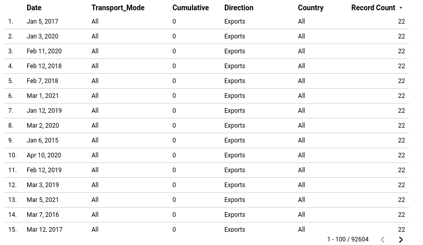
Tables
Tables are an effective means of presenting a large amount of structured information, with rows and columns enabling easy comparison of variables. However, when it comes to identifying high-level trends, users can easily become overwhelmed by the sheer volume of data presented in tables.
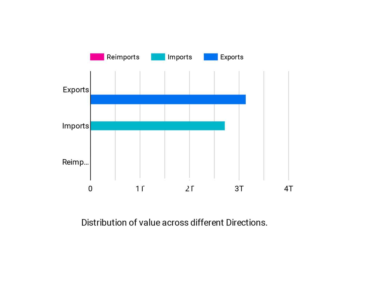
Pie and Stacked Bars
Pies and Stacked Bars are graphs that get divided into sections but represent the part as a whole. These are simple techniques to organize the data and compare the size of each component.

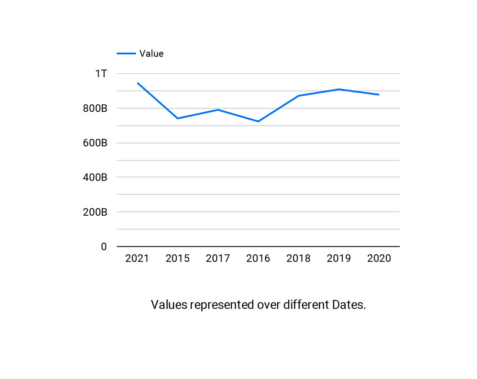
Line and Area Charts
The visuals that show change by one or more quantities in plotting a data point series over time are used frequently. Line graphs are particularly useful for showing changes, while the area charts connect more data points, stack the variables and allow for easy comparison between the variables.
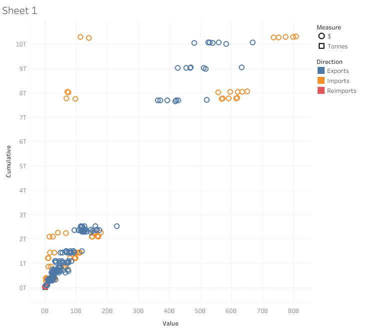
Scatter Plots
The visuals that are beneficial for representing the relationship between two variables are used Regression analysis employs visuals that effectively illustrate the relationship between two variables. However, they are visualized with three variables in the x and y axis and the size of a bubble.
Tools for Data Visualization:
There are many tools available for data visualization, both open-source and commercial. Some popular open-source tools include D3.js, Matplotlib, and Tableau Public, while commercial tools include Tableau Desktop, QlikView, and Microsoft Power BI. These tools offer a wide range of features for creating static and interactive visualizations, from simple charts and graphs to complex dashboards and interactive applications. They also provide options for customization, data connection, and collaboration, making them valuable for business, research, and personal use.
Plotly
Plotly is an open-source platform with several data visualization libraries built using Python. Their products vary from Dash to Chart Studio and are customizable. Plotly integrates with other libraries and is easily available. However, creating impactful visualizations requires a combination of pre-existing knowledge and coding skills. Pre-existing knowledge helps to understand the data and its context, while coding skills are necessary to transform the data into meaningful and impactful visualizations. There is limited documentation supported alongside.
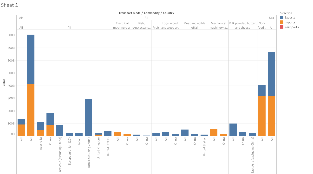
Tableau
Tableau is more user-friendly but has limited functionality. Tableau is one of the easiest data visualization tools available in the market and has great interactive visualizations that can handle large amounts of data well. Tableau’s main functionality is the drag-and-drop feature that has the functionality to create dashboards without it impacting the integrity of their work. However, tableau does have some limitations, such as the coding skills required to manipulate data before it can be imported into tools.
The graph above displays the performance of Apple’s stocks over time. By tracking the stock prices visually, we can easily identify significant events that occurred and observe their impact on the stock’s performance.
Microsoft Power BI
Power BI is a commercial software that comes with a free version, offering users great visualization capabilities coupled with robust data connectivity and the ability to incorporate data modeling. It allows users to create interactive dashboards and reports with minimal training required.
Conclusion
Data visualization is an essential practice that facilitates the effective communication of information and insights through graphical representation of data. Data visualization is a powerful tool for summarizing complex information, identifying patterns and trends, and communicating insights to a wide audience. By representing data in charts, graphs, maps, and other visual formats, data visualization can empower businesses and researchers to make data-driven decisions and communicate findings more effectively. Successful data visualization requires careful consideration of various factors, including data quality, context, representation, interactivity, design, security, privacy, and governance. This holistic approach ensures that visualizations accurately reflect the data, meet business objectives, and engage users, leading to better decision-making and improved outcomes.
Related Articles


Related Articles
Established in 2012, Xgrid has a history of delivering a wide range of intelligent and secure cloud infrastructure, user interface and user experience solutions. Our strength lies in our team and its ability to deliver end-to-end solutions using cutting edge technologies.
NAVIGATE
Cloud & DevOps Web & Mobile Apps Temporal Digital Marketing GTM Engineering Marketo Consulting HubSpot Consulting Company Careers ResourcesOFFICE ADDRESS
US Address:
Plug and Play Tech Center, 440 N Wolfe Rd, Sunnyvale, CA 94085
Dubai Address:
Dubai Silicon Oasis, DDP, Building A1, Dubai, United Arab Emirates
Pakistan Address:
Xgrid Solutions (Private) Limited, Bldg 96, GCC-11, Civic Center, Gulberg Greens, Islamabad
Xgrid Solutions (Pvt) Ltd, Daftarkhwan (One), Building #254/1, Sector G, Phase 5, DHA, Lahore
Xgrid © 2026. All rights reserved.